

Emotion Behind The Font: Professional
- Sep 7, 2016
- 2 min read

Font Displayed: Maximo
Kayla Creative's
Emotion Behind the Font
Social Media Series

Behind every font, there is an emotion...
A great design tip is to choose a font that best reflects your visual. Here at Kayla Creative we are creative yet simple. In our new social media design series, Emotion Behind The Font, will help demonstrate some ways to utilize fonts!
Emotion Behind the Font was created to give a visual aid in choosing fonts for design. A striking image and a specific font are paired together to convey the "emotion" or message that the font portrays.
What makes a font look professional?
Professional fonts are ones that are not too fancy, immediately legible, and universal. When you think of professionalism, everything has to be "sharp" and classic. Just like the timeless black and white suit.
Professional fonts would typically be used on resumes, business presentations, newspapers, etc. They are trustworthy because of their reliableness and multi-usage. Use a professional font to be taken seriously and to give an clean touch.
Here are some professional font examples that you can never go wrong with!

Helvetica
Need it in bold? Need it in semi-italic? Need it to be light/thin? Helvetica is one of those fonts that comes in astonishing catalogue of styles and variations. And for that reason it can be used it many different situations. They don't call this the king of fonts for no reason!
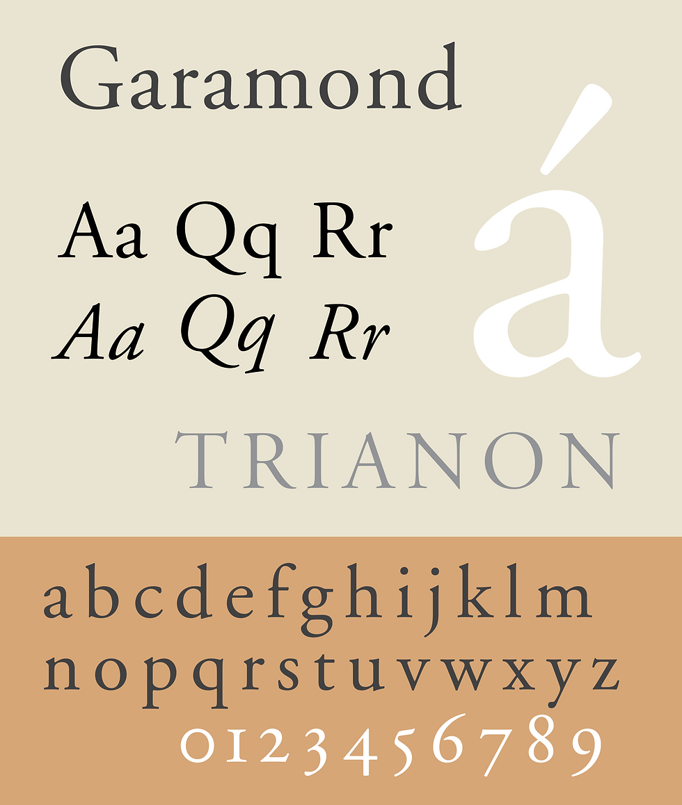
Garamond
A professional font that has been around for centuries (since the 1600s!). It usually comes preinstalled in most word processors which makes it easily accessible. Garamond actually pairs well with Helvetica. Helvetica can be used a for the heading and Garamond can be used for the text in the body.

Lato
This font is actually a good choice for corporate use! Like Helvetica, it comes in a variety of weights and styles. If you are looking to keep it professional, but friendly and open, Lato would be a great choice to use!


Comments